What is BootStrap?
Mobile devices are very common nowadays. Accordingly, the high number of mobile visitors of websites compels us to turn to different designs.
Designed according to the computer screen, sensitive-flexible (responsive) will be useless without the web pages in cihar such as a tablet or phone.
There are different methods to develop mobile-friendly web pages. However, among these methods, there is probably no one that can be applied as easily as BootStrap.
We can call it a FrameWork that contains ready-made Html, Css and JavaScript libraries for BootStrap. It is completely free and we can easily apply it to our pages.
We can summarize the basic logic of using BootStrap as follows: We have a Css file containing ready-made Css classes and a JavaScript file containing ready-made JavaScript methods . All we have to do is use these style templates and methods.
Its biggest advantage is that it can automatically adapt to the screen of the device on which the web pages are displayed.
It was developed by the programmers Mark Otto and Jacob Thornton working for Twitter and made available as open source in 2011.
In 2017, 4 versions of BootStrap, which were updated a number of times, were also made available.
Differences between BootStrap 3 and BootStrap 4
BootStrap version 4 has been released claiming to work faster and offer more flexibility. Although it works fine in the latest versions of the most used browsers, it is not supported in Internet Explorer 9 and earlier versions.
If your pages must appear properly in these browser versions, it would be more appropriate to use BootStrap version 3. All 3 versions are still under development and support , and it is the most stable version. Only new features are not added to this version.
Things to Do to Use BootStrap
All you have to do is link three documents with ready-made templates and libraries to your web pages.
-
If you wish, you can download the latest versions of these files from getbootstrap.com and place them on your own site.
-
Or you can connect via CDN . Using this method will have the following advantage: Most of the users will have visited different websites using BootStrap before, so the necessary files will be readily available in the users browser cache . In other words, we will not need to download these files again for our site and the loading of our site will be faster.
BootStrap 3 CDN Link
For BootStrap 3 version, you can paste the following link codes in the head of your page.
<!—Last published and minimized CSS file -->
<link rel="stylesheet" href="https://maxcdn.bootstrapcdn.com/bootstrap/3.4.0/css/bootstrap.min.css">
<!-- jQuery library -->
<script src="https://ajax.googleapis.com/ajax/libs/jquery/3.3.1/jquery.min.js"></script>
<!—Last published JavaScript file -->
<script src="https://maxcdn.bootstrapcdn.com/bootstrap/3.4.0/js/bootstrap.min.js"></script>
BootStrap 4 CDN Link
To use BootStrap 4, you must paste the css link in the head part and the javascript links at the end of the body part.
Paste the code below in the head section.
<link rel="stylesheet" href="https://maxcdn.bootstrapcdn.com/bootstrap/4.4.1/css/bootstrap.min.css">
<script src="https://ajax.googleapis.com/ajax/libs/jquery/3.4.1/jquery.min.js"></script>
<script src="https://cdnjs.cloudflare.com/ajax/libs/popper.js/1.16.0/umd/popper.min.js"></script>
<script src="https://maxcdn.bootstrapcdn.com/bootstrap/4.4.1/js/bootstrap.min.js"></script>
As you can see from the link codes above, BootStrap uses JQuery for JavaScript plugins. The use of jQuery is required for some classes such as modals. If we are not going to use these classes, we can omit the JQuery connection and use only Css classes.
Here is the most basic code for a sample page using BootStrap 3, after adding the meta tags that provide the links.
<!DOCTYPE html>
<html>
<head>
<title>Bootstrap Example</title>
<meta charset="utf-8">
<meta name="viewport" content="width=device-width, initial-scale=1">
<link rel="stylesheet" href="http://maxcdn.bootstrapcdn.com/bootstrap/3.3.6/css/bootstrap.min.css">
<script src="https://ajax.googleapis.com/ajax/libs/jquery/1.12.0/jquery.min.js"></script>
<script src="http://maxcdn.bootstrapcdn.com/bootstrap/3.3.6/js/bootstrap.min.js"></script>
</head>
<body>
Your content.
</body>
</html>
After that, you can create your pages either by using the objects you create yourself or by using ready-made BootStrap objects. It will not be difficult for you to learn which bootstrap class does what. You can follow Bootstrap classes and usage examples on our site.
Using BootStrap 3 Grid System
BootStrap is based on page rendering using a 12 grid system.
12 columns with a width of 1 unit can be placed inside the div elements with the “row” class applied.
The width of each column can be determined separately. The important thing is that their total is 12 units. E.g;
4+4+4
2+6+4
3+3+3+3
2+3+4+3
examples could be multiplied.
We can open a div tag with the row class applied at the desired location of our page and apply this system inside.
Columns can be made to appear in different widths on different types of screens to provide responsive page design. This is the biggest advantage of BootStrap.
For this, 4 different Grid classes are defined in BootStrap:
-
xs (screens smaller than 768 px)
-
sm (screens from 768px to 991px)
-
md (screens from 992px to 1200px)
-
lg (1200px and larger screens)
Expressions like “col-*-*” are used to specify the width of a column. Let's explain this with an example.
<div class="row">
<div class="col-sm-4">Box1</div>
<div class="col-sm-4">Box2</div>
<div class="col-sm-4">Box3 </div>
</div>
When the “col-sm-4” class is applied to the div element in the example above, we indicate that that element will occupy 4 units of space on screens larger than 768px. Since a different width is not specified for md and lg here, it will occupy 4 units on those types of screens.
However, this will not be valid on smaller xs screens , the width of these divs will be 100%, ie 12 units on xs screens.
In this case, on xs screens, these 3 div elements will be placed one under the other, and on sm and larger screens, they will be placed side by side and occupy 4 units of space.
The way to try this is by narrowing the browser window to see how your page looks at different sizes. When you narrow the browser window enough, the divs will overlap, and in a window larger than 768px, they will be placed side by side.
By applying multiple grid classes to a div element, we can make it appear different widths on different screen sizes.
Let's examine the example below:
<div class="row">
<div class="col-sm-6 col-md-4">Box1</div>
<div class="col-sm-6" col-md-4>Box2</div>
<div class="col-sm-12 col-md-4">Box3 </div>
</div>
The div elements here are placed on 4 different screens as follows:
-
They are placed next to each other with a width of 4 units on LG, that is, wide screens . Since there is no such application as “col-lg-*”, the width specified for md also applies to lg.
-
On md screens, they are placed side by side with a width of 4 units.
-
On sm screens, box1 and box2 are placed side by side with a width of 6 units, while box3 goes to the bottom and takes up 12 units, ie 100% width.
-
Since width is not specified on xs screens, all 3 boxes are placed one below the other and 100% wide.
If desired, we can specify separate widths for all 4 screen types. It is important that the sum of the widths written for each screen type should be 12 on the same line. Md's are 12 among themselves, sms are 12 among themselves, etc.
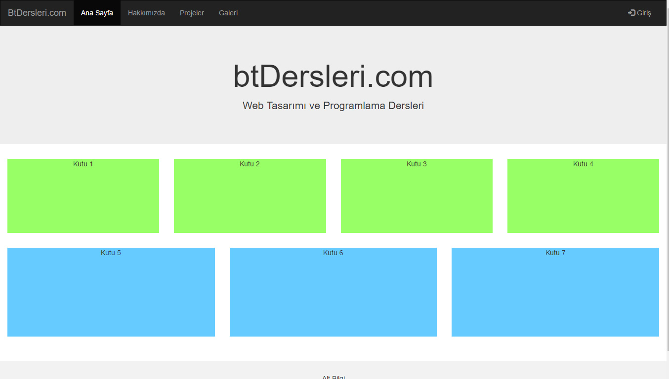
Check out the different page designs in the topic examples section.
Let's talk about some basic Css Classes used in page design with BootStrap:
Container class:
It is used as the main layer. The borders are determined by taking the whole page or a section between these tags. There are two different types, container and container-fluid. When the container class is applied, some outer space is left on the sides, while the container-fluid class fills the screen completely.
<div class="container">
<div class="row">
<div class="col-sm-6 col-md-4">Box1</div>
<div class="col-sm-6" col-md-4>Box2</div>
<div class="col-sm-12 col-md-4">Box3 </div>
</div>
</div>
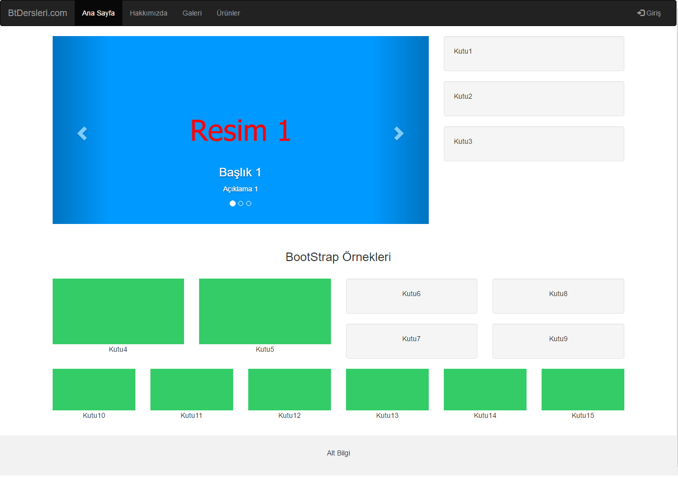
Navbar class:
Creates a navigation pane located at the top of the page . It can contain elements such as drop-down menus, buttons, etc.
By giving the Collapse feature, it can be turned into a drop-down menu on narrow screens.
Examine the topic examples.
Hidden-xs, hidden-sm, hidden-md and hidden-lg classes:
Allows an html element to be hidden in desired screen types. For example, an element with hidden-md class will be hidden on md screens while it will appear on other types of screens.
<div class="hidden-xs hidden-sm">
In the above example the div element will be hidden in the xs and sm classes.
Carousel Class:
It is a structure that allows transition between pictures etc. objects in the form of a slide show, and can also work by dragging on touch screens.
bootstrap tutorials, how to use bootstrap, bootstrap 3 and 4 differences, examples of creating pages with bootstrap and ready pages, bootstrap lessons, bootstrap lectures
EXERCISES
Run the examples and collapse and expand the browser window. In this way, you can examine how the page looks on different screens.
|
BootStrap Page Tutorial
|
Try It
|
Run the examples and collapse and expand the browser window. In this way, you can examine how the page looks on different screens.
Read 2127 times.