Placing Divs Side by Side with Inline-Block Feature
On our previous page, we talked about placing tags such as div and li using floats.
In this case, we will do the same thing without using float and clear.
We mentioned that the div tags created as below will be placed one under the other.
<body>
<div id="mainKatman">
<div id="topLayer">Title etc</div>
<div id="leftLayer">Our Links</div>
<div id="middleLayer">Content 1</div>
<div id="rightLayer">Content 2</div>
<div id="bottomLayer">Alt Bilgi</div>
</div>
</body>
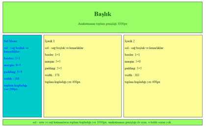
In the example above, the boxes named leftLayer, middleLayer and rightLayer are required to be placed side by side. For these three boxes
We can implement the feature.
Elements whose display feature is made inline-block;
-
They can be placed side by side like inline elements.
-
Values such as width, height, margin etc. can be applied to block elements.
#leftLayer, #middleLayer, #rightLayer
{
display: inline-block;
}
As you can see, it is possible to easily place divs side by side with this method. Also, we don't need to use an empty div with clear:both applied.
However, there are some points to be considered in this method as well.
Things to pay attention:
If the div elements placed next to each other take up more than the width of the parent layer, they will not fit side by side. In this case, the last div will slide down and the layout will be broken.
A space will automatically be left between adjacent div elements (as they are now inline elements). This will cause those divs to take up more space and shift than we calculated. This situation can be overcome by different methods. The easiest is to leave no space between the closing div and the opened div tag:
<div id="leftLayer">
Our links
</div><div id="middleLayer">
Content 1
</div><div id="rightLayer">
content 2</div>
When written as above, no space will be placed between the divs and our width calculation will give the correct result.
When calculating the total footprint of the divs, margin, padding and border values should also be calculated. (see Css Box Model)
Another problem is that the div elements placed next to each other will have different contents, in which case their heights will also be different. That's when we can overcome the vertical alignment problem that arises by using vertical-align.
#leftLayer, #middleLayer, #rightLayer
{
display: inline-block;
vertical-align: top;
}
When the vertical-align property is set to top, the boxes are aligned relative to their top points. The bottom value aligns them with their bottom points, and the middle value aligns them with their midpoints.
Check Other Pages For Related Subjects to Tableless Design:
1. Tableless Design and Div Element
2. Placing Divs Side by Side with the Float Feature
3. Placing Divs Side by Side with Inline-Block Feature
inline-block divs slide to the bottom, the width is too much and does not fit, inline block spacing problem, placing divs and li tags side by side using inline block
EXERCISES
|
Placing divs side by side with inline-block feature
|
Try It
|
By clicking on the Try It button, you can access the codes for example and see the result by making changes.
Read 1676 times.